Before and After: Modern Spanish Revival Kitchen Remodel In Tuscaloosa
We love a good transformation, and this home is no exception! We couldn’t wait to get started when a young couple approached us to help update the heart of their 1940s Spanish-style home, located in downtown Tuscaloosa. Keep reading to see how we created a space that would function better for their family.
The Goal | Set a Clear Vision
The homeowners are in the construction industry, so they had the demolition and build-out covered. They came to us for help with the overall design and selections. Their goal was to make the home more functional for their family and to create the best use of a smaller space while honoring the original style of the home’s architecture. That’s where our Toulmin Kitchen & Bath team came in. For perspective, this is a 1,776 square foot, Spanish-style, stucco home built in the early 1940s. Leaning into the home’s style and character was important to the homeowners and our interior design team, so each selection – from the tile feature wall to the cabinet hardware – was carefully considered during this renovation.
The Design | Create a Space that Works For You
Dark wood paneling, green linoleum floors, and Formica countertops – oh my! While the outside of the home screams “Spanish Revival,” the inside needed some help. Our goal was to create the feel of a larger, brighter, and more inviting space that feels fresh and timeless while embracing the Spanish style of the home.
The Frameless (European) Cabinetry
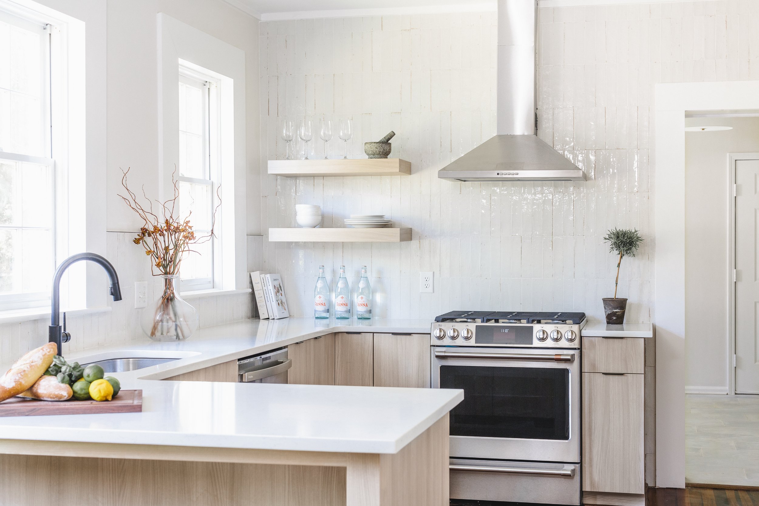
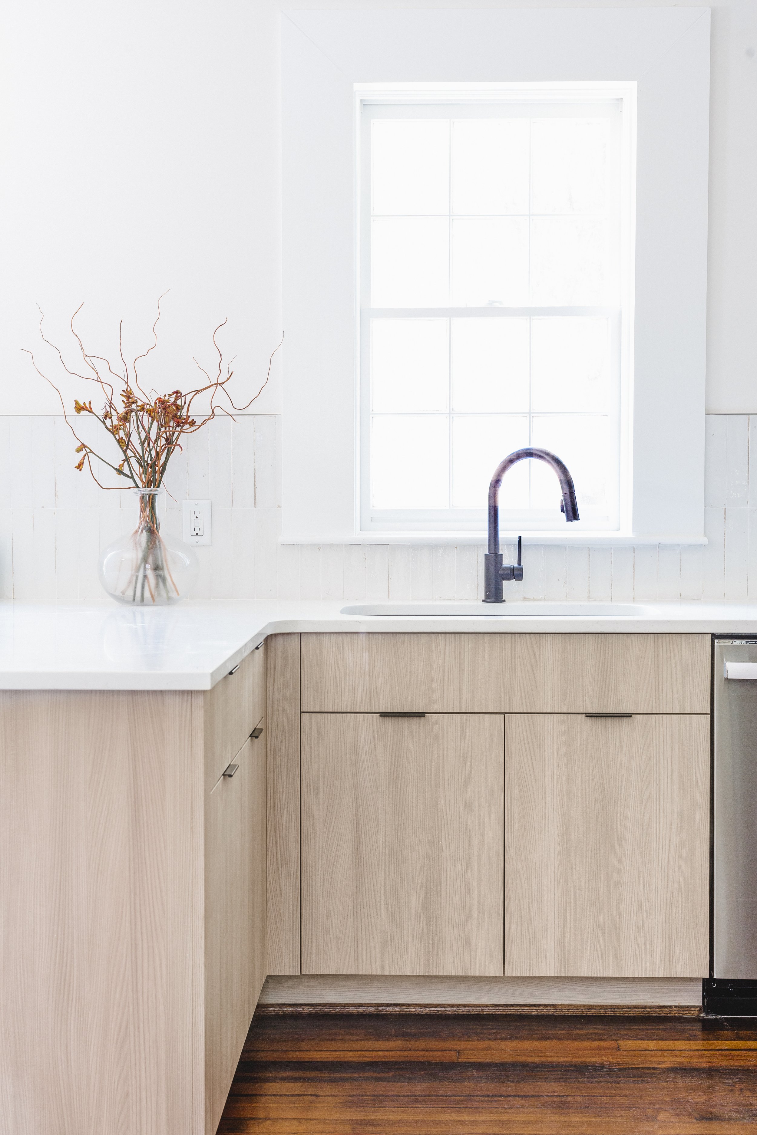
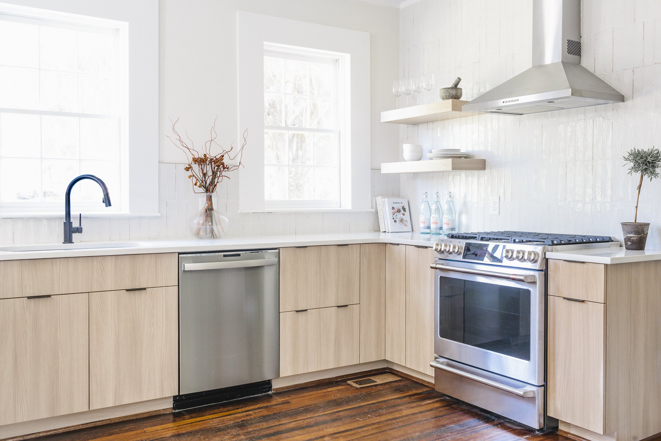
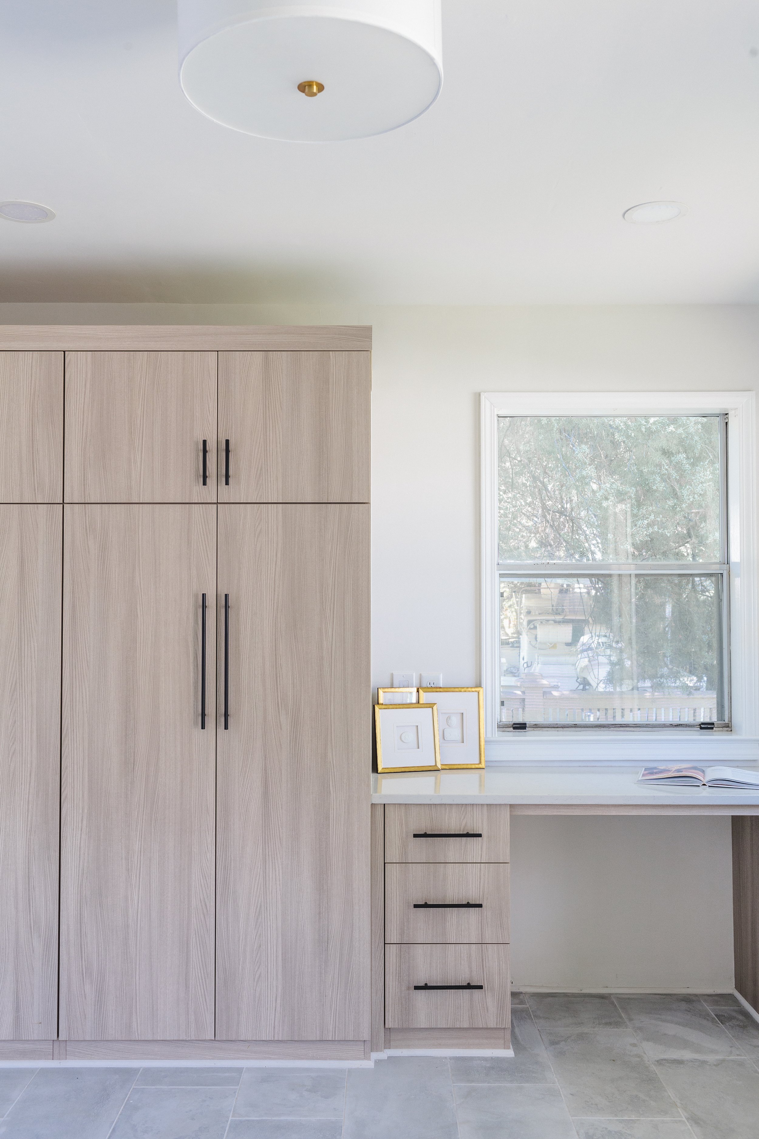
Our clients wanted the space to feel light and bright, but they didn’t want an all-white kitchen. They loved the idea of light natural wood cabinetry, so we selected frameless style cabinetry (also called European style cabinetry) with a Thermally Fused Melamine Laminate (TFL) door in Natural Elm. We went with a light wood grain to bring some warmth to the space, and the TFL doors are very durable as they are heat, moisture, stain, and wear-resistant.
The Elixir Backsplash
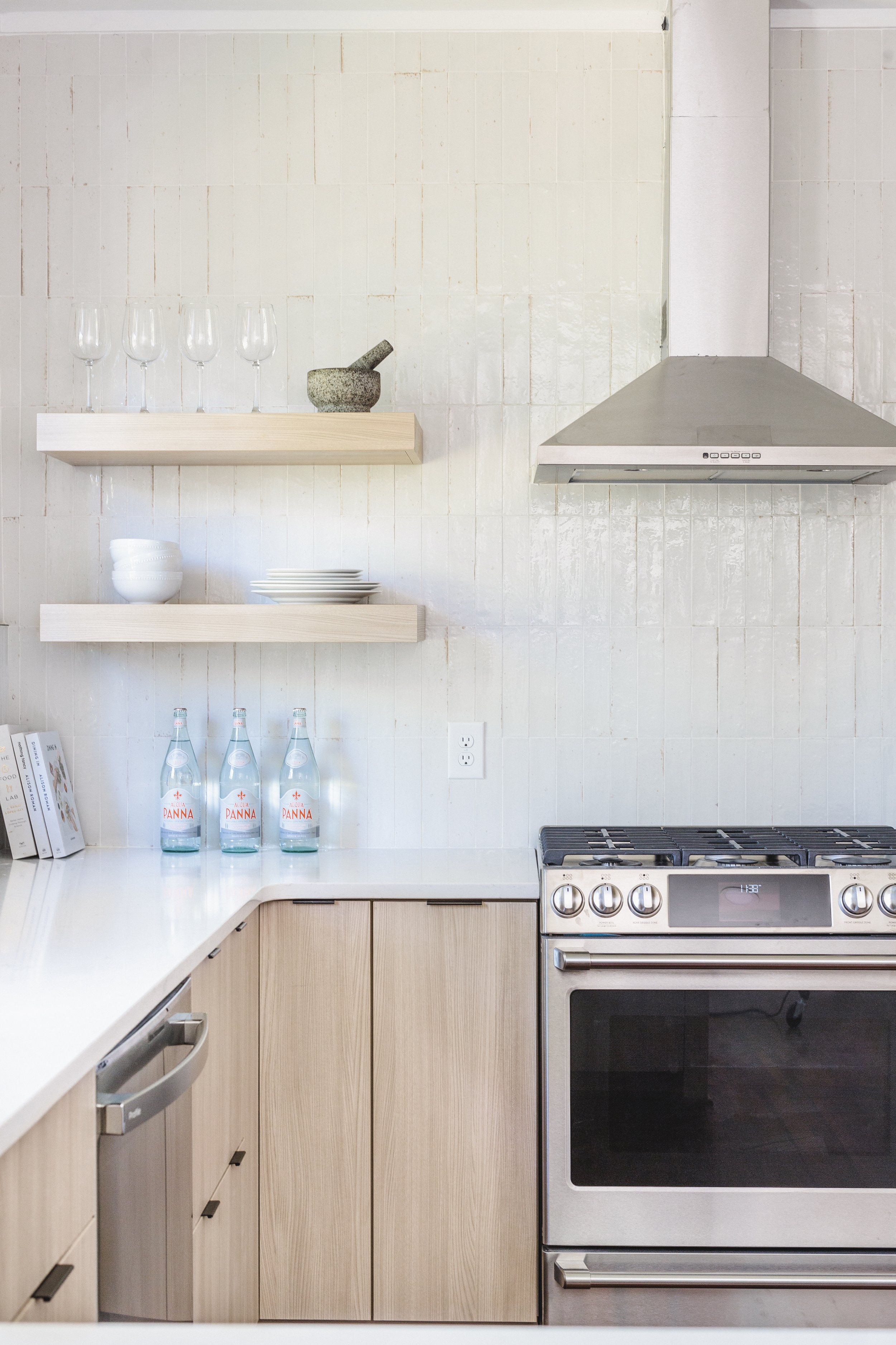
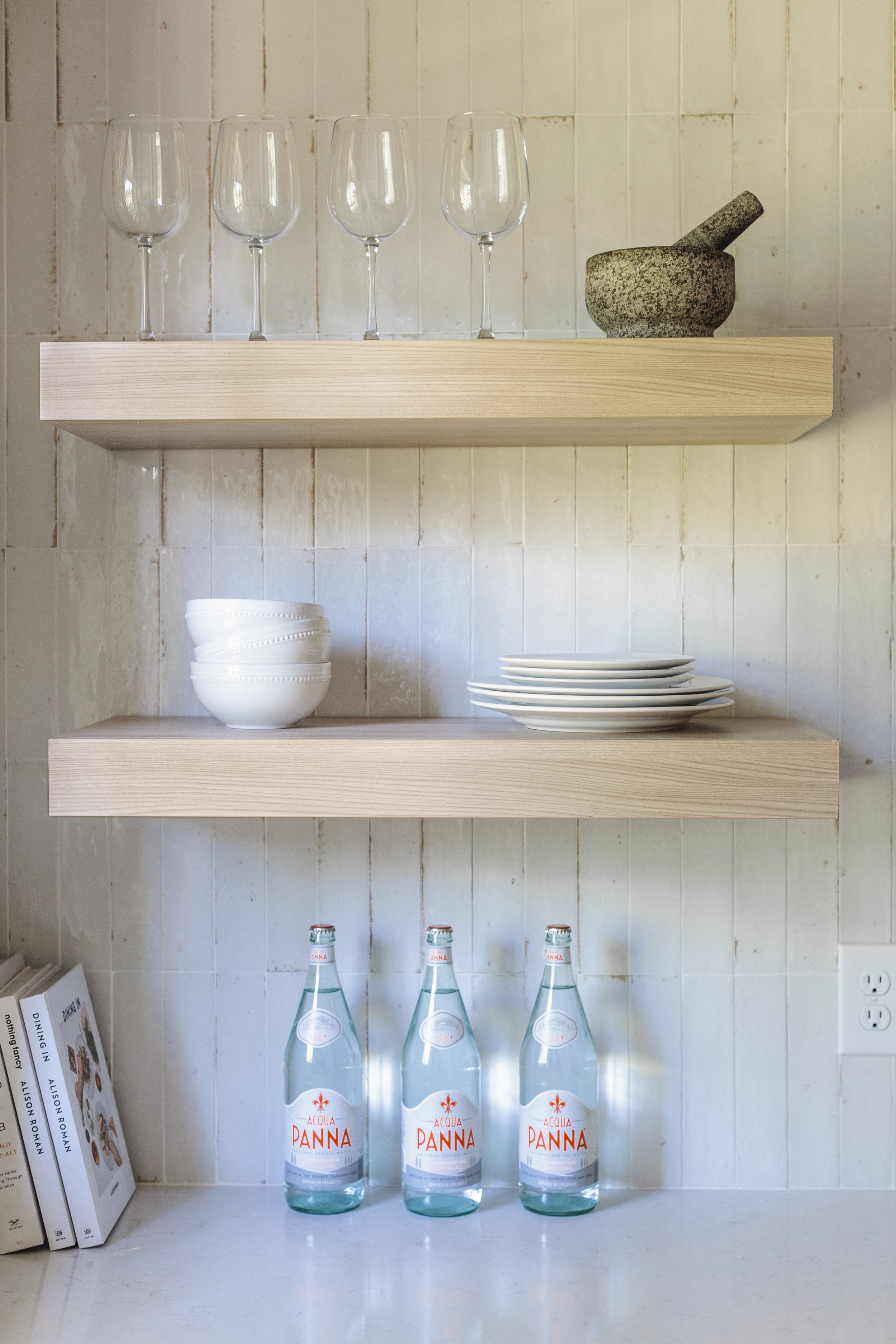
The Daltile Glazed Subway Tile in "Elixir", was installed vertically behind the range from countertop to ceiling, adding visual interest and drawing your eye up, making the space feel larger. The handmade-look, heavy glazed tile gives a nod to the home’s origin and feels like it could have been there all along. The range wall is visible from the entrance of the home, so we really wanted it to make a statement. The floating shelves to the left of the stainless vent hood help visually balance the tiled wall while giving shelf space to display beautiful glassware.
All of this is a beautiful complement to the timeless and durable Daltile Quartz Countertop in "Niagara".
The Matte Black Cabinet Hardware & GE Cafe Appliances
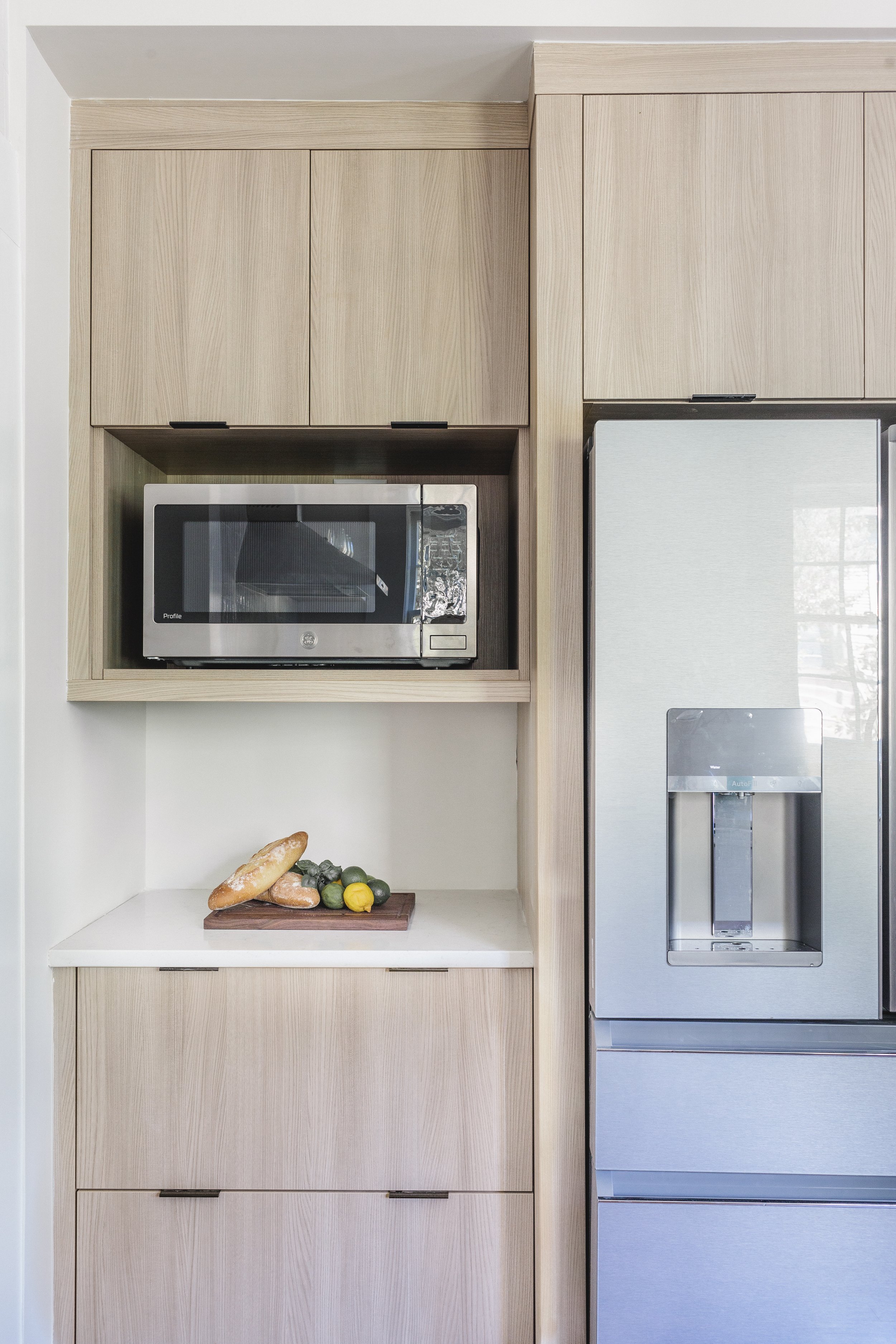
To add contrast to the light walls, trim, and cabinetry, we added matte black cabinet hardware and a matte black Delta Trinsic Faucet at the sink. These Tab Pulls from Hardware Resources were the perfect modern and minimal touch on the frameless cabinetry. The homeowners wanted to start fresh with their appliances, so they selected sleek, stainless steel pieces from GE Cafe.
Heart Pine Wood Flooring
To everyone’s surprise, the original floors were salvageable! You’ll notice beautiful heart pine flooring that the homeowners sanded and refinished themselves. This was a “pinch me” moment for our team and the clients as it truly keeps the character while blending seamlessly with our new design aesthetic.
The Kitchen Details | Form and Function
At Toulmin Kitchen & Bath, when we design your kitchen, we consider everything from where you’ll store your spices in proximity to your range to where you’ll store the cleaning supplies—no detail is overlooked.
Designing A Functional Kitchen
When designing a space that doesn’t have a very large footprint, it truly does come down to the details. Since the kitchen is the heart of the home and where we spend so much of our time, we expanded its footprint into what was formerly a hall closet. We used this additional area as a nook for the refrigerator and microwave, plus some additional storage. This change not only made more sense for cabinet and appliance placement, but by moving the location of the refrigerator it no longer interferes with the traffic flow in the kitchen.
A Kitchen Designed With Family In Mind
One of the most important things when discussing a renovation is finding out how your family uses or plans to use the space. What roadblocks and pain points are currently there, and how can we eliminate those and make the space work better for you? Another “roadblock” we discussed was the former eat-in breakfast area. For this young family, peninsula seating made more sense for dining, entertaining, and everyday use.
An Efficient Kitchen With Creative Cabinetry Solutions
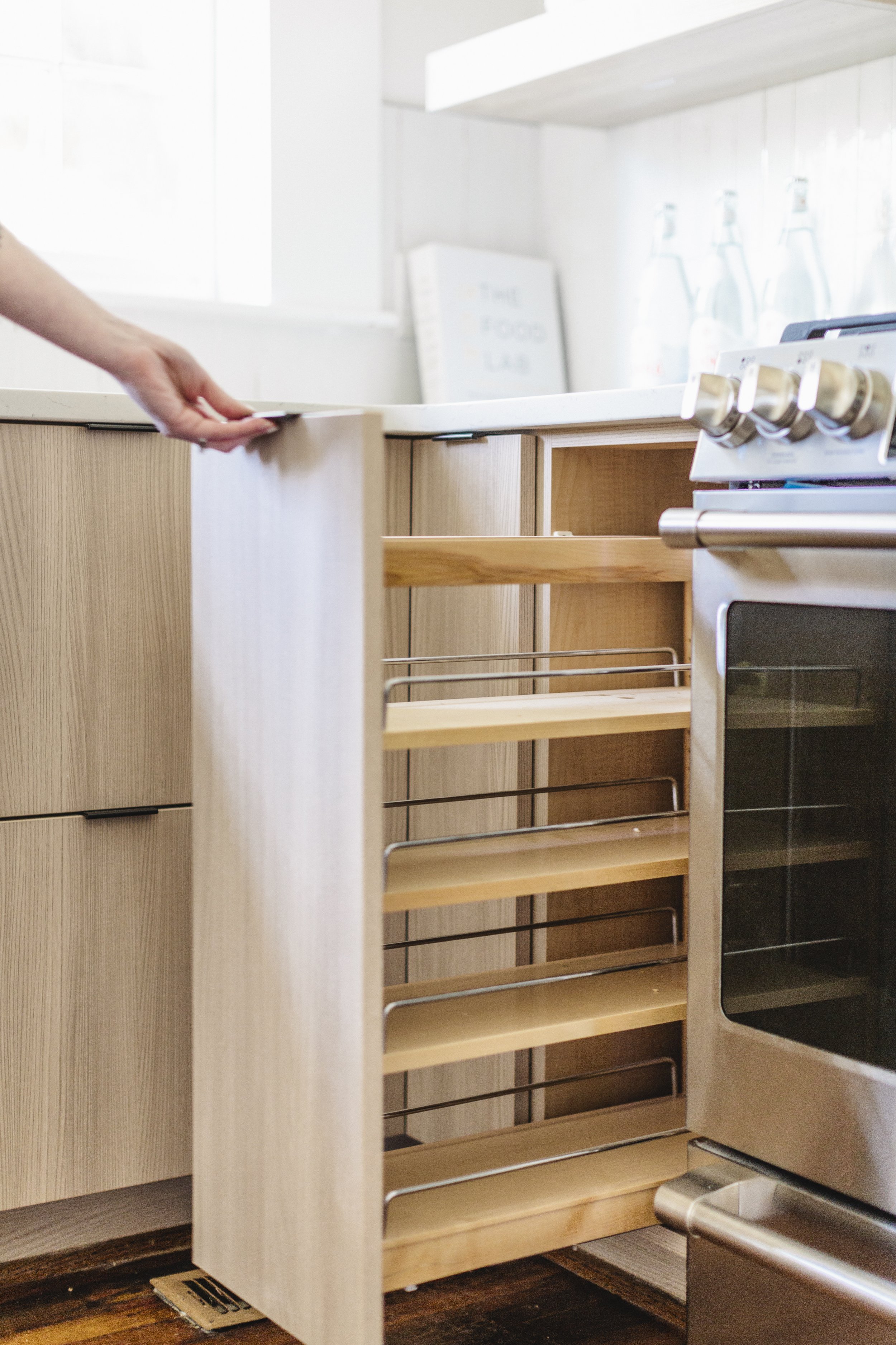
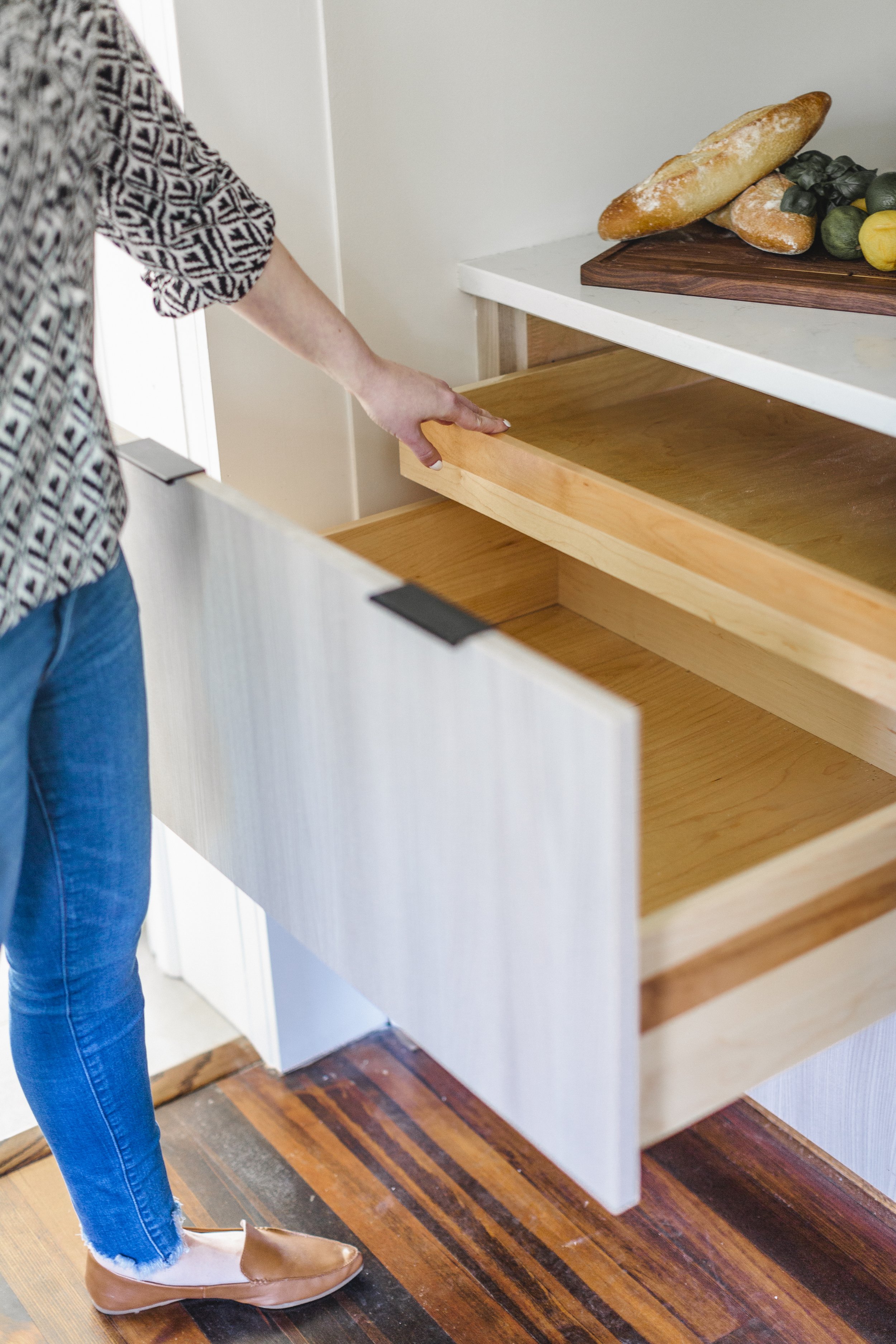
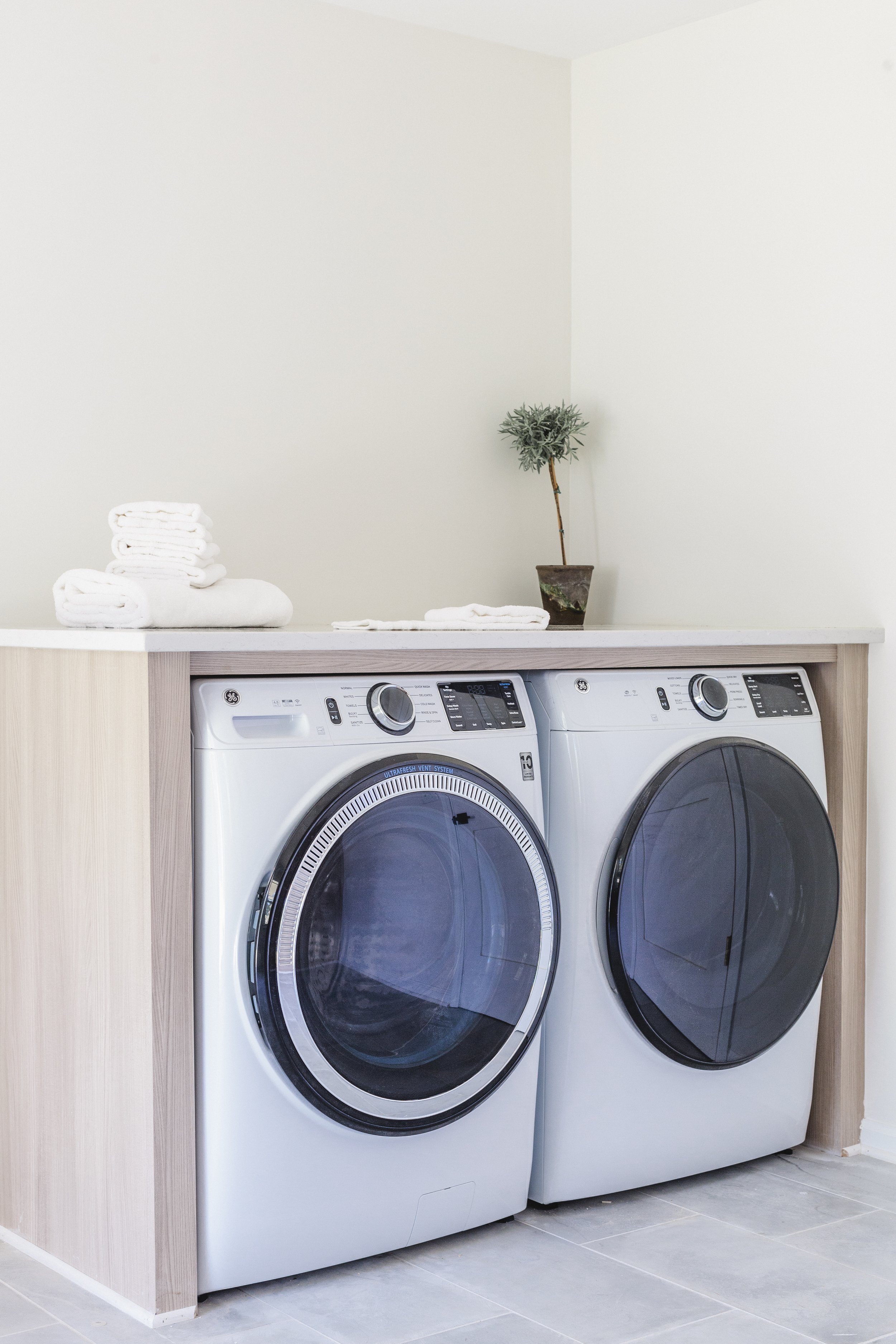
This new kitchen design focused on utilizing every inch to create the most efficient use of space for this young family. We added functional details like this Spice Cabinet to the left of the range, as well as touches like the drawer-within-a-drawer to keep the visually minimalistic feel of the space. In the laundry room, we created a multi-use space by adding additional cabinet storage with tall doors that have adjacent desk space, and by encasing the washer and dryer with counter space above.
One of the tall cabinets now serves as the closet for brooms and other household items where they can be tucked away and stored out of sight.
We know many great memories will be made in this beautiful new, thoughtfully curated space.
If you're planning a kitchen or bath remodel in the West Alabama area, give the designers at Toulmin Kitchen and Bath a call at (205) 579-9906. Let us help you design and deliver your dream kitchen.

